
WORK COLLECTION
JUSTFOUND_RE-BRAND
Overview
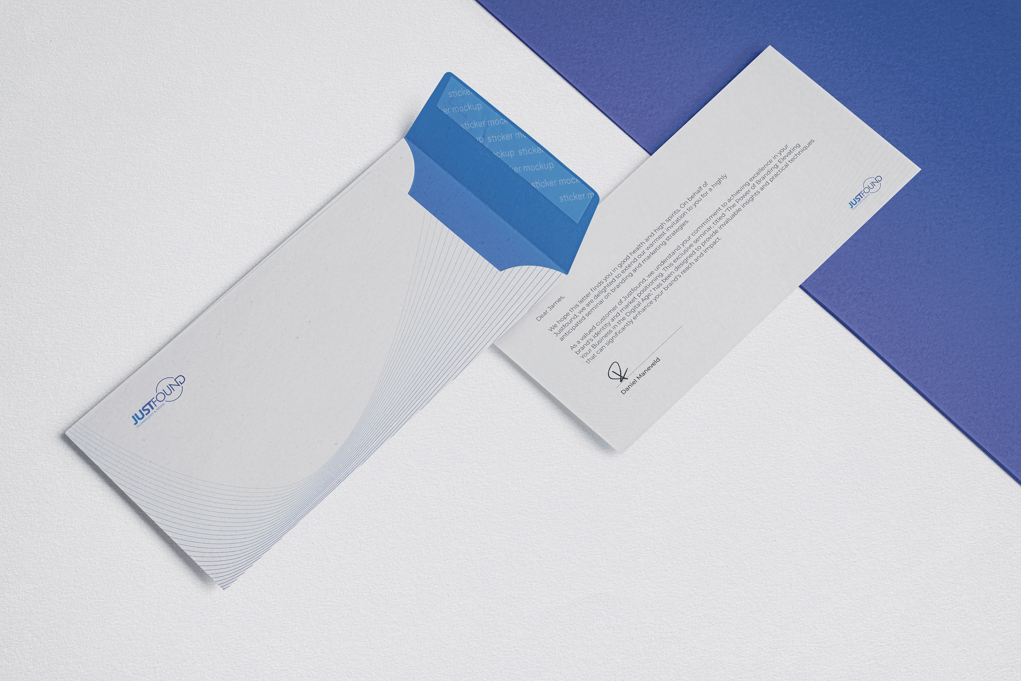
Justfound PTE LTD. were looking for a brand refresh. The original logo incorporated a compass as the foundation of the company was travel-based. The company shifted its focus to media production and social media management and wanted to retain a "global feel".
Approach
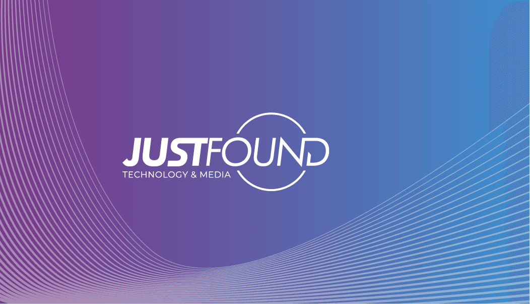
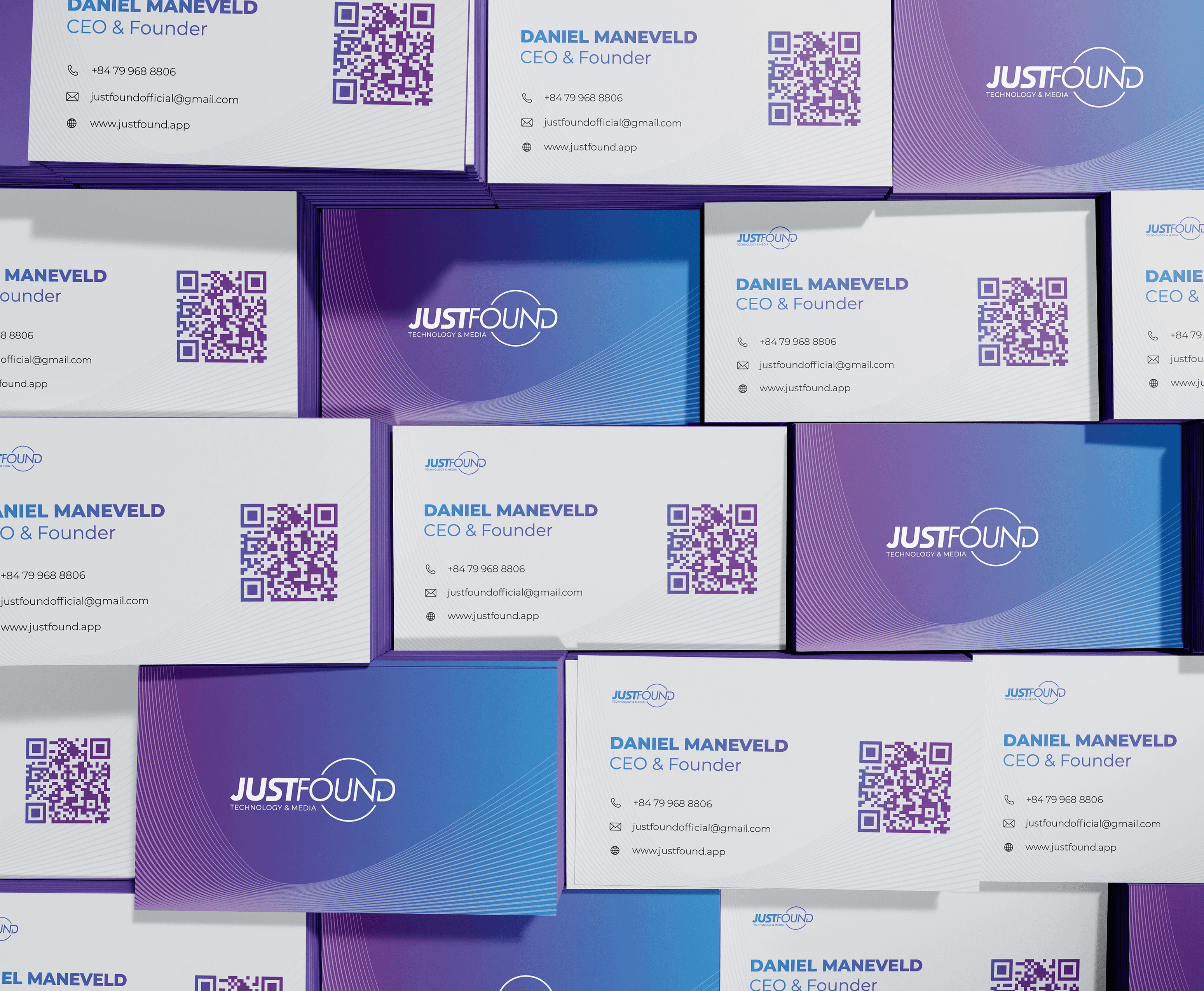
The Logo:
Edgy + current. The logo portrays movement from the circular device and the Italic font.
The Colours:
Based on the founders vision, the company needed to have a strong "tech" feel to it, but with a bit of "funk" to humanize the brand.
The purple and blue gradient convey energy + sophistication while the off-white background provides a neutral middle ground which avoids the clinical aesthetic when using pure white.